#css dropdown navbar
Explore tagged Tumblr posts
Visit Tumblr Blog
Explore Tumblr blogs with no restrictions, modern design and the best experience.
Last Seen Tumblr Blogs


Fun Fact
In 2020, Tumblr had 29.4 million users in the US.
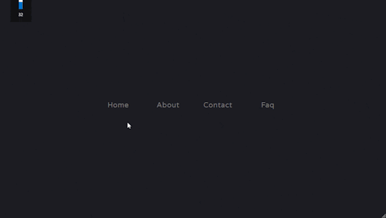
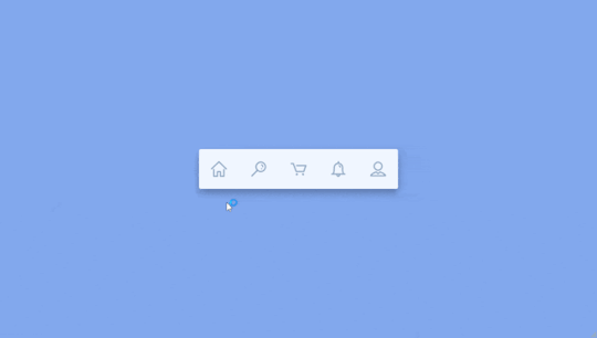
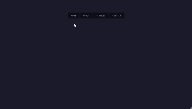
Text

Dropdown menu using HTML CSS
#simple dropdown menu#frontenddevelopment#codenewbies#html css#html5 css3#css dropdown menu#dropdown menu#html css dropdown menu#css tutorial#css dropdown navbar#css#css3
1 note
·
View note
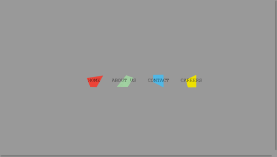
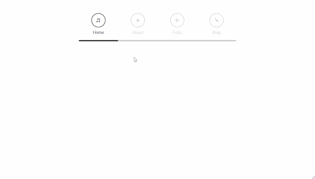
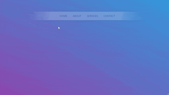
Text
Bootstrap 5 Multi-level Dropdown Menu
#bootstrap 5 multi-level dropdown menu#bootstrap dropdown#bootstrap snippets#html css#webdesign#code#learn to code#css3#html#divinectorweb#css#frontenddevelopment#responsive navbar#responsive web design
1 note
·
View note
Text
#copy code#codepen#dropdown#tools#code tools#html#css#navbar#menu#links#html tools#css tools#otros tumblrs#artículo
1 note
·
View note
Note
Dropdown is like, mostly css for websites. Little more complex for bespoke programs. It is fun how there's so many ways to go about implementing them though.
your ask was so powerful tumblr said i had ten new things in my inbox do you have a tutorial on hand for it that handles multiple buttons separate buttons that have drop down functions on the same navbar that are clickable and not hover? thats what i keep exploding
omg i was saying that just now in a chat where i was crying so pitifully that i really do like how every tutorial you can get a feel for the personality of the person who assembled it like, someone who doesnt explain terms is so use to those terms they dont understand theyre just saying random letters together, another person is still in the habit of defining things people use css for in html, seeing stuff that uses two completely different ways to do it yet still making buttons!!!
2 notes
·
View notes
Text
Building Stunning and Accessible Navigation Menus with ShadCN
Navigation menus are super important in any app or website. They help users find their way around easily. ShadCN makes it easy to create menus that look amazing and work perfectly.
This blog will show you how ShadCN simplifies menu creation. Let’s explore the key design ideas behind ShadCN and provide practical examples to help you build menus that are both user-friendly and visually appealing.
Why ShadCN for Navigation Menus?
ShadCN is a special toolkit that brings together the power of Tailwind CSS and the flexibility of Radix UI. This unique combination makes it the perfect choice for building stunning and user-friendly navigation menus. Here's why:
Effortless Style: ShadCN seamlessly integrates with your existing Tailwind CSS design system. This means your menus will automatically look and feel consistent with the rest of your application, saving you time and effort.
Accessibility Built-In: ShadCN components like dropdowns, sidebars, and tabs are designed with accessibility in mind from the very start. This ensures that everyone, regardless of their abilities, can easily navigate your application.
Easy Customization: Want to tweak the colors, add a unique touch, or make it truly your own? ShadCN gives you the freedom to customize each component to perfectly match your brand's style and personality.
By choosing ShadCN, we're not just building menus; we're creating an exceptional user experience that is both beautiful and accessible.
Step-by-Step Guide to Building Navigation Menus with ShadCN
Here’s how you can get started:
Install ShadCN
npx shadcn-ui@latest init
Create a Sidebar Menu Let’s build a responsive sidebar menu using ShadCN and Tailwind CSS:
//Example Navbar.tsx import { Sidebar } from "shadcn-ui"; export function Navbar() { return ( <Sidebar> <Sidebar.Section> <Sidebar.Item href="/dashboard">Dashboard</Sidebar.Item> <Sidebar.Item href="/profile">Profile</Sidebar.Item> <Sidebar.Item href="/settings">Settings</Sidebar.Item> </Sidebar.Section> </Sidebar> ); }
Add a Dropdown Menu Use dropdown menus for nested navigation options:
import { Dropdown } from "shadcn-ui"; export function UserMenu() { return ( <Dropdown> <Dropdown.Trigger> <button>User Menu</button> </Dropdown.Trigger> <Dropdown.Content> <Dropdown.Item href="/profile">Profile</Dropdown.Item>{" "} <Dropdown.Item href="/logout">Logout</Dropdown.Item> </Dropdown.Content> </Dropdown> ); }
Role-Based Navigation with Conditional Rendering Implement dynamic menus based on user roles using conditional rendering:
import { Sidebar } from "shadcn-ui"; export function RoleBasedSidebar({ role }: { role: string }) { const menuItems = { admin: [ { label: "Dashboard", href: "/admin/dashboard" }, { label: "Manage Users", href: "/admin/users" }, ], user: [ { label: "Dashboard", href: "/user/dashboard" }, { label: "My Profile", href: "/user/profile" }, ], }; return ( <Sidebar> <Sidebar.Section > {menuItems[role]?.map((item) => ( <Sidebar.Item key={item.href) href = { item.href } > { item.label } </Sidebar.Item> ))} </Sidebar.Section > </Sidebar > ); }
Enhancing Accessibility in Navigation Menus
ShadCN ensures accessibility by default, but here’s how you can take it further:
Use ARIA roles like role="navigation" for the main menu container.
Add aria-current="page" for active menu items to improve screen reader support.
Use keyboard navigation to ensure menus are operable without a mouse.
Key Benefits of Using ShadCN for Menus
Ease of Use: Pre-built components save time and effort. Customizability: Modify styles and behaviors to fit your brand. Accessibility: Fully ARIA-compliant for a better user experience.
Common Challenges and How to Overcome Them
Responsive Design: Ensure menus adapt seamlessly to different screen sizes using Tailwind’s responsive utilities. Deep Navigation Hierarchies: Use nested menus or breadcrumbs for better usability.
Conclusion
ShadCN is a game-changer for building navigation menus, offering a seamless blend of design, functionality, and accessibility. Whether you're creating a simple dropdown or a complex sidebar, ShadCN’s components empower you to craft intuitive navigation experiences effortlessly.
0 notes
Text
Front End Developer Trainee
Title: Openings for Front End Developer Fresher
Role: Trainee
Location: Nagpur
Qualification: BE (any stream) MCA, BCA, BCCA, BSC, MSC.
Skills:
Html,css
Javascript
Sql
Description:
Learn Html and css.
Learn Boootstrap grid,table,navigation,navbar,dropdown,corousel etc.
Learn Css Flex box.
Learn designing concept of UI vs UX.
Learn Javascript variables,functions,operators,arrays,string etc.
Learn Javascript approach,tweet count,fibonacci series,fizzbuzz challenge etc.
Learn jquery benefits and how to embed jquery in website.
Benefits:
Placement Guarantee
Technical and Practical Training
Training by Professional Developers
Internship will be included in this program
Live Projects
Training Certification
6months Internship Certification will be provided.
Apply Here => Jobs Micro
0 notes
Text
Bootstrap 5: What You Need to Know
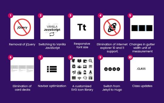
Bootstrap 5, the latest iteration of the popular open-source web development tool, brings significant changes and improvements. Here’s a quick rundown:
Removal of jQuery: Bootstrap 5 bids farewell to jQuery, opting for vanilla JavaScript instead. This streamlines the framework, reducing bloat and improving performance.
Switching to Vanilla JavaScript: With jQuery out of the picture, developers can now rely on native JavaScript, simplifying code and enhancing compatibility.
Responsive Font Size: Bootstrap 5 introduces a responsive font size engine, ensuring typography adapts seamlessly across devices.
End of Internet Explorer 10 and 11 Support: IE 10 and 11 are no longer supported in Bootstrap 5, allowing developers to leverage modern JavaScript standards without compatibility concerns.
Changes in Gutter Width Unit of Measurement: The gutter width unit shifts from pixels to rems, offering more flexibility in layout design.
Elimination of Card Decks: Card decks are replaced with a more flexible grid system in Bootstrap 5, streamlining responsive design.
Navbar Optimization: The navbar component is optimized for better performance and simplified markup, with added dark dropdown functionality.
Customized SVG Icon Library: Bootstrap 5 introduces a new SVG icon library, providing developers with a wide range of reusable icons.
Switch From Jekyll to Hugo: Bootstrap 5 integrates with Hugo, a fast and flexible static site generator, for improved performance and ease of use.
Class Updates: Some CSS classes are removed or added in Bootstrap 5, enhancing the framework’s simplicity and functionality.
In conclusion, Bootstrap 5 continues to evolve, focusing on lightness, simplicity, and speed to empower developers in creating modern, responsive websites.
For More Information Read Blog : EVERYTHING YOU SHOULD KNOW ABOUT BOOTSTRAP 5
0 notes
Text
Explore 15+ CSS Horizontal Navigation Menus
Welcome to CSS Monster, your premier destination for exploring 15+ CSS horizontal menus! In this comprehensive article, we've meticulously curated a collection of free HTML and CSS code examples for horizontal menus, meticulously sourced from respected platforms such as CodePen, GitHub, and other reliable resources. Horizontal menus are a favored choice for displaying navigation options prominently across the top of websites or applications. Our collection goes beyond the conventional, showcasing a diverse array of horizontal menu styles, including dropdown menus, mega menus, and more. This variety ensures that you'll discover the perfect design to elevate your project's navigation. With our latest update in August 2023, we're excited to introduce 2 new items to our collection, reflecting the cutting-edge trends in horizontal menu design. Whether you're a seasoned web developer, a designer seeking inspiration, or someone looking to enhance your website's navigation, these customizable code examples stand as a valuable resource. Dive into our hand-picked selection and witness the stunning diversity of horizontal menu designs that can truly enhance your user experience. Feel free to explore the latest trends, experiment with customization, and seamlessly integrate these code examples into your projects. Our collection is designed to cater to your needs, offering a blend of functionality and aesthetics. Embark on this journey to discover and implement captivating horizontal menu designs, and let your coding endeavors bring a new level of sophistication to your projects. Happy coding! Author seto89 March 4, 2019 Just Get The Demo Link How To Download - Article How To Download - Video Author HTML / CSS PURE CSS MAGIC LINE NAVBAR Compatible browsers: Chrome, Edge (partial), Firefox, Opera, Safari Responsive: yes Dependencies: - Author tris timb February 7, 2019 Just Get The Demo Link How To Download - Article How To Download - Video Author HTML / CSS (SCSS) POSITION STICKY SUBNAV Compatible browsers: Chrome, Edge (partial), Firefox, Opera, Safari Responsive: yes Dependencies: - Author Mehmet Burak Erman June 3, 2018 Just Get The Demo Link How To Download - Article How To Download - Video Author HTML (Pug) / CSS (Stylus) PERSPECTIVE MENUS Compatible browsers: Chrome, Edge (partial), Firefox, Opera, Safari Responsive: yes Dependencies: - Author Stas Melnikov March 5, 2018 Just Get The Demo Link How To Download - Article How To Download - Video Author HTML / CSS HOVER EFFECT FOR HORIZONTAL MENU Compatible browsers: Chrome, Edge (partial), Firefox, Opera, Safari Responsive: yes Dependencies: -
Author Mehmet Burak Erman December 18, 2017 Just Get The Demo Link How To Download - Article How To Download - Video Author HTML / CSS (SCSS) MENU HOVER LINE EFFECT Compatible browsers: Chrome, Edge (partial), Firefox, Opera, Safari Responsive: yes Dependencies: -
Author Charlie Marcotte September 5, 2017 Just Get The Demo Link How To Download - Article How To Download - Video Author HTML (Pug) / CSS (Sass) CSS HORIZONTAL MENU Compatible browsers: Chrome, Edge (partial), Firefox, Opera, Safari Responsive: yes Dependencies: -
Author Artyom June 23, 2017 Just Get The Demo Link How To Download - Article How To Download - Video Author HTML / CSS (SCSS) STRIKETHROUGH HOVER EFFECT FOR MENU Compatible browsers: Chrome, Edge (partial), Firefox, Opera, Safari Responsive: yes Dependencies: -
Author Irvine Potok February 22, 2017 Just Get The Demo Link How To Download - Article How To Download - Video Author HTML / CSS LAVALAMP CSS MENU Compatible browsers: Chrome, Edge (partial), Firefox, Opera, Safari Responsive: yes Dependencies: -
Author Marco Biedermann June 16, 2016 Just Get The Demo Link How To Download - Article How To Download - Video Author HTML / CSS (PostCSS) HORIZONTAL ICON NAVIGATION Compatible browsers: Chrome, Edge (partial), Firefox, Opera, Safari Responsive: yes Dependencies: -
Author Aaron Benjamin April 30, 2015 Just Get The Demo Link How To Download - Article How To Download - Video Author HTML / CSS SLIDE HORIZONTAL MENU Compatible browsers: Chrome, Edge (partial), Firefox, Opera, Safari Responsive: yes Dependencies: -
Author Claudio Holanda March 7, 2015 Just Get The Demo Link How To Download - Article How To Download - Video Author HTML / CSS (Less) SKEWED MENU IN HTML AND CSS Compatible browsers: Chrome, Edge (partial), Firefox, Opera, Safari Responsive: yes Dependencies: -
Author Dominik Biedebach January 19, 2015 Just Get The Demo Link How To Download - Article How To Download - Video Author HTML / CSS HORIZONTAL NAVIGATION EFFECTS Compatible browsers: Chrome, Edge (partial), Firefox, Opera, Safari Responsive: yes Dependencies: -
Author Karim Balaa January 6, 2015 Just Get The Demo Link How To Download - Article How To Download - Video Author HTML / CSS SIMPLE MENU NAVIGATION Compatible browsers: Chrome, Edge (partial), Firefox, Opera, Safari Responsive: yes Dependencies: - Author Justin October 8, 2014 Just Get The Demo Link How To Download - Article How To Download - Video Author HTML / CSS ANIMATED UNDERLINE HOVER Compatible browsers: Chrome, Edge (partial), Firefox, Opera, Safari Responsive: yes Dependencies: -

Author Andy Tran September 2, 2014 Just Get The Demo Link How To Download - Article How To Download - Video Author HTML/Haml FLAT HORIZONTAL NAVIGATION Compatible browsers: Chrome, Edge (partial), Firefox, Opera, Safari Responsive: yes Dependencies: -
Author MrPirrera August 23, 2014 Just Get The Demo Link How To Download - Article How To Download - Video Author HTML / CSS TRANSPARENT FADING NAVIGATION BAR Compatible browsers: Chrome, Edge (partial), Firefox, Opera, Safari Responsive: yes Dependencies: -
Author Bogdan Blinnikov April 15, 2014 Just Get The Demo Link How To Download - Article How To Download - Video Author HTML / CSS (Less) RESPONSIVE MENU EFFECT Compatible browsers: Chrome, Edge (partial), Firefox, Opera, Safari Responsive: yes Dependencies: - Author Carl Rosell October 9, 2013 Just Get The Demo Link How To Download - Article How To Download - Video Author HTML / CSS (SCSS) HORIZONTAL MENU Compatible browsers: Chrome, Edge (partial), Firefox, Opera, Safari Responsive: yes Dependencies: -
FAQs
1. What are CSS horizontal menus? CSS horizontal menus are navigation elements displayed horizontally at the top of a website or application. They provide an organized and visually appealing way to present navigation options. 2. Why choose horizontal menus for a website? Horizontal menus are a popular choice as they prominently display navigation options, making it easy for users to access different sections of a website or application. They offer a clean and efficient design. 3. What styles of horizontal menus are included in the collection? Our collection features a diverse range of horizontal menu styles, including dropdown menus, mega menus, and more. This variety ensures that you can find the perfect design to suit your project's needs. 4. How often is the horizontal menu collection updated? We regularly update our collection to stay current with the latest trends in horizontal menu design. The August 2023 update introduces 2 new items, reflecting the cutting-edge developments in this space. 5. Can I customize the CSS horizontal menu code examples? Absolutely! The CSS horizontal menu code examples in our collection are customizable, allowing you to tailor them to match your website's design and aesthetic preferences. 6. Are these horizontal menus suitable for all types of websites? Yes, our collection caters to a variety of needs, making it suitable for different types of websites and applications. Whether you're working on a personal blog or a business website, you'll find relevant designs. 7. How can I integrate these horizontal menu designs into my project? Each horizontal menu design in our collection comes with its HTML and CSS code example, making integration into your projects a straightforward process. Copy and paste the code to enhance your website's navigation.
Conclusion
In conclusion, CSS Monster invites you to explore and implement 15+ CSS horizontal menu designs into your web projects. With diverse styles, including dropdown menus and mega menus, our collection reflects the latest trends in design. Elevate your user experience, streamline navigation, and bring a touch of sophistication to your projects. Happy coding! Read the full article
0 notes
Text
How To Use CSS To Create Menus And Navigation Bar
CSS stands for Cascading Style Sheets, and it is a language that can be used to style and customize HTML elements on a web page. CSS can create custom menus and navigation bars by using properties such as display, position, flexbox, grid, hover, etc.
To create a CSS menu, you need to define two things: the menu items and the menu style. The menu items are the links or buttons that you want to display on your menu. The menu style is the way you want to arrange and decorate your menu items.
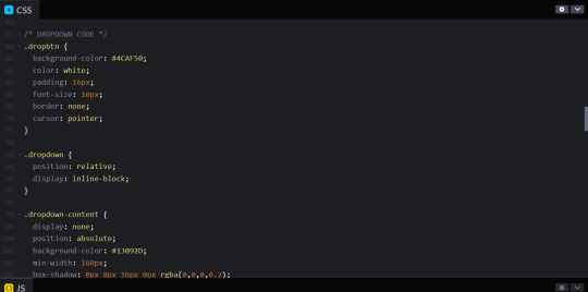
For example, if you want to create a simple horizontal menu with four items, you can use the following code:<!-- Define the menu items --> <ul class="menu"> <li><a href="#">Home</a></li> <li><a href="#">About</a></li> <li><a href="#">Services</a></li> <li><a href="#">Contact</a></li> </ul> /* Define the menu style */ .menu { list-style: none; /* Remove the bullet points */ display: flex; /* Use flexbox to arrange the items horizontally */ justify-content: space-around; /* Distribute the items evenly */ align-items: center; /* Align the items vertically */ } .menu li { padding: 10px; /* Add some space around the items */ } .menu a { text-decoration: none; /* Remove the underline */ color: black; /* Set the text color */ } .menu a:hover { color: white; /* Change the text color on hover */ background-color: blue; /* Add a background color on hover */ }
This will result in the following output:
![menu]
As you can see, the menu items are displayed horizontally, with some spacing and styling. You can also use different properties or values for different items to create more complex and creative menus.
To create a CSS navigation bar, you need to define two things: the nav element and the nav style. The nav element is a semantic HTML element that represents a section of a page that links to other pages or sections. The nav style is the way you want to position and decorate your nav element.
For example, if you want to create a simple fixed navigation bar with four items, you can use the following code:<!-- Define the nav element --> <nav class="navbar"> <ul class="menu"> <li><a href="#">Home</a></li> <li><a href="#">About</a></li> <li><a href="#">Services</a></li> <li><a href="#">Contact</a></li> </ul> </nav> /* Define the nav style */ .navbar { position: fixed; /* Fix the position of the nav element */ top: 0; /* Set the top position to zero */ left: 0; /* Set the left position to zero */ width: 100%; /* Set the width to 100% of the viewport */ height: 50px; /* Set the height to 50 pixels */ background-color: blue; /* Set the background color */ } .menu { list-style: none; /* Remove the bullet points */ display: flex; /* Use flexbox to arrange the items horizontally */ justify-content: space-around; /* Distribute the items evenly */ align-items: center; /* Align the items vertically */ } .menu li { padding: 10px; /* Add some space around the items */ } .menu a { text-decoration: none; /* Remove the underline */ color: white; /* Set the text color */ } .menu a:hover { color: black; /* Change the text color on hover */ }
This will result in the following output:
![navbar]
As you can see, the nav element is fixed at the top of the page, with a blue background and white text. You can also use different properties or values for different elements to create more complex and creative navigation bars.
CSS menus and navigation bars can make your web pages more user-friendly and attractive. You can use them to create different types of menus and navigation bars, such as vertical, dropdown, responsive, etc. You can also combine them with other CSS properties and selectors to create more unique and customized menus and navigation bars.
If you want to learn CSS from scratch must checkout e-Tuitions to learn CSS online, They can teach you CSS and other coding language also they have some of the best teachers for there students and most important thing you can also Book Free Demo for any class just goo and get your free demo.
0 notes
Text
oh yeah. with the new navigation bar it means I have to add in the new code to every fuckgin page. i will not like this. but i have to do this. the things we do for love.
things to add in to every bloody page:
navbar css code
anchor link css code (.stagelink & .navlink)
dropdown div to the navbar shit
dropdown-content (the chapter pages/event stories)
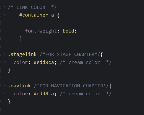
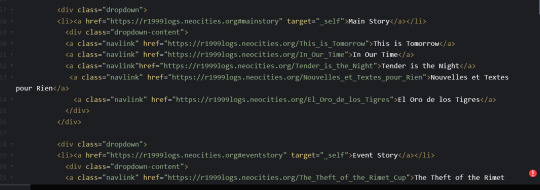
Should I write down the logs for charlie's anecdotes (it will be gone in 22 hours) or should i focus on adding in rimet cup/site tweaking
#r1999 webbed site posts#yes i know my code is turning into spaghetti at this point#i had to make a new div class and completely overwrite the container value because the anchor links for the sidebar and navbar#have different colors#well.. technically it'll depend on what option will win out in that poll for the navbar formatting
16 notes
·
View notes
Text
Webflow tutorial: the absolute beginner's guide
By the end of this tutorial, you’ll learn how to create your first homepage in Webflow and leave with a solid understanding of how to build powerful websites in Webflow — by visually coding HTML and CSS.
There’s a lot of hype around the no code movement — a wave of technologies that allow us to build software without code. But code is at the internet’s core. It’s not about the absence of using it to build websites and apps. This movement is actually focused on making it easier (and faster) to code — by making it visual. Meaning, you just design and platforms like Webflow write the code for you.
If you approach Webflow with the mindset of designing, based on the fundamentals code, you’ll be able to learn it quickly. And on top of that, you might end up learning how to code as well.
What is Webflow? Webflow is a design and web development tool, ecommerce, CMS, and hosting platform. Each aspect of the platform is represented by a particular product/feature set:
The Designer gif of building a website in Webflow A visual web design tool firmly grounded in web standards and best practices, the Designer translates your design decisions into clean, production-ready HTML, CSS, and JavaScript. We built it to enable designers to develop websites in a familiar way — i.e., visually — without sacrificing quality.
If you’re mostly a prototyper, you can use the Designer alone, either sharing the prototype with devs to reproduce, or exporting the code.
But to experience the full power of Webflow, you’ll want to combine the Designer with the CMS and our Hosting.
The CMS gif of creating CMS collection in Webflow Like the Designer, the CMS is a code-free web development tool. It has both in-Designer elements (where the site designer works) and on-site elements (where the client and/or content managers work). We call the latter element the Editor, but more on that later.
For now, just know that in the Designer, the CMS lets you structure content types you’ll publish over and over again — like blog posts, product pages, etc. — by combining modular “fields.” Once you’ve created your content types, which we call Collections, you can then use the Designer to determine how Collection items look on the site (like how individual blog posts look).
Ecommerce
Webflow Ecommerce lets you take the power of the Designer and CMS to create a fully custom ecommerce experience. Any Webflow project can be converted into an ecommerce site, but the hosting price differs slightly from a regular website.
You can connect your ecommerce website with payment gateways like Stripe, Apple Pay, Paypal, or Google Pay, while also extending your stores capabilities with various integrations.
Hosting Webflow's hosting stack The final piece of the Webflow puzzle is our Hosting platform. Backed by Amazon Web Services (AWS) and Fastly, it’s blazing fast, super-reliable, has enterprise grade security, and you’ll need it to enjoy some of our best features, including:
The CMS
The Editor
Form management
Responsive images (automatic resizing of images by device to improve performance)
Free SSL/HTTPS (improved site security that Google is basically making a must for sites that ask for visitor information)
Okay, now that we have the lay of the land, let’s talk about diving in.
Designing and building a homepage Before we create our first blank project, we need to understand how websites are fundamentally built on the web — HTML and CSS.
The fundamentals: box model Websites use the box model, a design principle that lets us understand that everything on a web page is basically a box within a box. These boxes are HTML components known as “divs.”
showing the box model principle on the Webflow homepage In the image above, we have a section (outlined in black), a container (outlined in red) to keep everything responsive within the section, and various divs (outlined in blue) that act as content within the container.
The nomenclature for section, container, and div comes down to how you style and label the divs, using what are known as CSS classes.
We use CSS for spacing, positioning, alignment, fonts, and styles of these HTML boxes and their contents. We add what is known as a CSS class to each box, which is like a preset you create for style settings. Classes are reusable throughout the site and allow you to stay organized as you build out your website.
To sum it up:
HTML is the component on a page
CSS is the design of that component
Congratulations, you now have a general understanding of how websites are built. A fun exercise you can do now is go to your favorite website, say apple.com, and open up your web browser’s inspect element.
picture of apple.com using inspect element You can view the code (on the right) and see how everything is a box (aka a div). Within those divs are sometimes other divs with content like headings, paragraphs, and buttons. This is all HTML. You can see how the designer of apple.com labeled their classes for each component/element and div, while also being able to view the CSS in the Styles section.
Okay, let’s get building.
Building in the Designer The best way to learn Webflow is to actually build in Webflow. To get the most out of this guide, I’ll need you to follow me in all of the steps we are about to go over.
The first step is to create a blank project.
blank project in the Webflow Designer Here you’ll see everything you need to build any powerful website. On the left side, you’ll see everything you need to add and edit components, and on the right, you’ll see everything you need to style those components.
In Webflow, the first 3 buttons on the left side of the Designer are what you use for HTML elements.
adding HTML components buttons The first is your Add Elements panel. Here you can add components like divs, buttons, text, images, forms, etc. The second is where you can add and manage symbols. These are sections that you can pre-save and reuse on multiple pages, like your navbar or footer. The third is the Navigator, where you can see the hierarchy and structure of your components.
Before we drop any elements onto the canvas, let’s determine our typeface and the font size of our Body (the main page we build on).
Start by selecting Body in the Navigator. Then, head over to the Style panel (on the right) and select the class "Body (All Pages)." Any style edits we do to this class can be reused on additional pages of our website. For example, if we want to add a main background color to all of our pages we would do that here. In this case, we’re keeping it the default white color.
gif of adding typography to Body (All Pages) class We’ll want to establish our base font and sizes by going to Typography and selecting a font from the list. You can also add a custom font in your project settings which will reflect in the dropdown.
We selected the font Verdana, and now we want to select the base font size. 16px is a standard for font size, and adding “1.4-” for the height will make sure that the font height is 1.4 times the font size. If you want to learn more about advanced web typography and font settings check out this video:
Okay, let’s add some elements. We’ll start by adding a pre-built navbar.
Next, below that we’ll add a Section div for our hero section. Once we drop in the Section div, we can add a class to it and name it “Hero Section,” just so we can stay organized and see all the elements neatly in our Navigator.
gif of adding navbar and section in the Designer We can now make some styling changes to our navbar, starting with making the background the same color as our Body.
gif of changing navbar color Just select the navbar in the Navigator and change the background color in the Style panel.
Now let’s add a logo. Make sure to have your logo saved as either a PNG or SVG and upload it to the asset manager in your Webflow project. From there, you can drag and drop the icon asset onto your canvas.
gif of adding logo in navbar Now let's adjust the padding on the logo and add an extra nav link.
adding padding on the logo Adding a new navbar link is as simple as copy and pasting — Command C and Command V on Mac, Control C and Control V on Windows.
Nice, we have a simple navbar. Let’s get down to the hero section.
We’ll start by adding a Container to our Hero Section. We want to recreate the current Webflow homepage (kinda) so we’ll also need to add a Grid to our container.
gif of adding grid to container Once the Grid is added, we can right click on it and delete the default extra row. This way we have a simple two column grid within our container.
Referring back to the box model, we’ll also want to add a div into each column and add classes to them (Left Column Grid and Right Column Grid) so we have them labeled properly and can style them later.
We added an image element to our Right Column Grid and now we can add our content within the Left Column Grid.
gif of adding heading, paragraph, and button to grid We start with a heading, a paragraph, and a button. As you can see in the video above, we can add our elements by dragging and dropping them onto the canvas, or by dragging and dropping them straight into our Navigator. When working with grids, it’s easier to align things within the Navigator. As you can see, we added the paragraph in the Navigator instead of on the canvas. This is because the element wasn’t going where we wanted it to go.
Now, we can add our content and style them using the Style panel on the right. Let's adjust the font size and add margin for spacing.
gif of changing font size and spacing Okay let’s make this look a bit better, starting with the CTA (call to action) button.
gif of styling button Let’s change the button color and add more padding between the button text and the inside edges of the actual button.
Button padding Padding on the CTA button We use padding for creating space inside elements, and margin for creating space outside of elements. For something like separating our heading, paragraph, and button, we used margin because we wanted to create space between these elements. But for our button, we wanted to create more space inside of the button element, so we used padding.
Which leads us nicely into the part where we add padding to our Hero Section to give our Grid some room from our navbar.
gif of adding top padding to hero section After adding padding to our Hero Section, we also want to center our image within the Right Column Grid to line it up with our Left Column Grid.
To do this, we just select on the Right Column Grid we made earlier and within the Style panel, click Align to Center. This will make sure all contents within the Right Column Grid fall to the center of the box.
Now let’s add a section to show off all the clients that we have.
gif of adding client logos grid After we create our five column grid, let's set the class name on the Grid to Client Logo Grid. Now, we'll want to upload our logos to our asset manager. I’ll be using one logo five times for demonstration purposes.
gif of adding logo images within the five column grid Simply drag and drop your logos into each column on the grid. After dropping the first image, we want to make sure our logo is in the middle of our grid. To center the logo, select the image and in the Style panel click Justify to center.
Because we are using the same logo for all five columns, I simply copied and pasted them (Command C and Command V on Mac, Control C and Control V on Windows) in the video above.
We just built our first homepage!
I’m not a great web designer, but hopefully you have a better understanding of how to approach Webflow as a beginner. If you can get this far, your Webflow development skills will pick up in no time.
For reference, here is how my Navigator looks. Notice the placement of our components:
image of components withing the Webflow Navigator But wait, we only know that this looks good on desktop. What about tablet or mobile?
Make it responsive Now, if you’ve ever worked with responsive design before, you’ll know that things can get a little hairy at this stage.
The good news is: Webflow has already done a lot of the hard work for you! To see that in action, we’ll step down through the various device previews available at the center of the Designer’s top bar:
image of top of Designer Now toggle through each breakpoint and see how it affects your design.
gif of toggling through different Webflow breakpoints If you design the way we did, Webflow will automatically try and make everything responsive. But sometimes you need to scale down, or move things around, if using Grid (which we are).
We can see that anything in tablet mode, or smaller, makes our featured image look off. Our font size is also a bit too big, along with our content being too close to the edges.
Let’s fix all of this.
Whatever design changes we make in tablet mode will reflect down to the smaller sizes. So start in tablet mode and work your way down as needed.
First, start by fixing the way the featured image is displayed. Instead of the image being squished to the right, we want to move it to the bottom of the hero section.
To do this, click on edit grid. From there add one extra row, and right click to delete the left column our featured image is in. This will automatically force our Right Column Grid, with our image in it, to the new bottom row we created.
gif of making grid responsive in tablet mode Once that happens, click Right Column Grid and move the image to the center of the div by clicking on Justify center. From there, add some top margin to Right Column Grid to bring it down.
Looking good, let’s move down to mobile landscape mode.
gif of mobile landscape First thing we see is that the font size is too big, let’s decrease that. Next, we want to bring our content in from the edges. To fix this, select the Container that our entire Grid is in and add padding to the sides.
Last one, let’s go to mobile portrait mode.
gif of mobile portrait Again, the font is too big. Let’s downsize the heading, paragraph, and button text.
We’re done!
As you can see, the client logos at the bottom stayed responsive and downscaled themselves. But if you want the logos to stack on top of each other, follow the exact same process we went through for the grid in our hero section.
You did it, your first responsive homepage, built in Webflow.
gif demonstrating responsive Webflow website You should be proud, I know I am. We just visually developed a whole homepage with code. Building in Webflow let us experience the power of code, without actually writing it. Check out all the HTML and CSS we visually wrote in this guide:
gif of showing Webflow code export That’s pretty cool if you ask me. If you have any questions, feel free to leave them in the comments below — happy creating!
Unleash your creativity on the web Build completely custom, production-ready websites — or ultra-high-fidelity prototypes — without writing a line of code. Only with Webflow.
Get started for free
More resources If you want to develop your web design skills, we highly recommend you check out our Ultimate web design course and other resources below:
Webflow University: learn web design, development, and time travel Webflow Forum: Q&A center Webflow Community: to talk to other people about your projects and learn about upcoming events and launches Webflow Blog: web design inspiration, guides, and tips Template Marketplace: purchase pre-made templates Webflow Showcase: the community hub for websites, including cloneables Webflow Experts: hire Webflow designers to help
1 note
·
View note
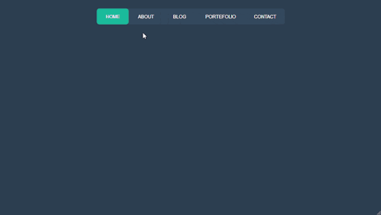
Text
Bootstrap 5 Multi-level Dropdown Menu
#bootstrap 5 dropdown menu#multi level dropdown menu#bootstrap 5#bootstrap 5 tutorial#responsive menu#navbar bootstrap#learn to code#html css#divinector#responsive webdesign#css#html
1 note
·
View note
Link
no js library, no javascript, pure CSS, responsif, multi dropdown
1 note
·
View note
Text
Responsive, Modern and Fully Customizable Pure CSS Framework - Punica
Responsive, Modern and Fully Customizable Pure CSS Framework – Punica
Punica is a lightweight, responsive, modern, and fully customizable front-end framework written in pure CSS/SASS/SCSS.
Grid Layout:
Fully responsive layout system based on CSS Grid
Elements Included:
Button & Dropdown
Form
Icon
Label
Table
Typography
Components Included:
Alert
Badge
Billboard
Breadcrumbs
Card
List
Menu
Navbar
Pagination
Panel
Process
Progress
Timeline
Tooltip
How to use it:
1.…
View On WordPress
2 notes
·
View notes
Link
Hi everyone, this web site offers you all free learning and practicing apportunity, in plenty different fields such as HTML, CSS, Bootstrap, JS, JQuery, C#,Java and more. No registration is needed, that is nice. In NavBar there is 4 dropdown and each has all listet and grouped well. Nice and easy to reach what you need. As and extra, left side menu at Home page, it is easy to scroll down and filter all options -as a good grouped again- and choose one to start you journey.
It is one of my favorite. Please share your ecperineces, feeling, and judgment with me as a comment and let see others to see what thinks others.
1 note
·
View note
Photo
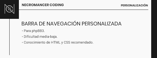
En este tutorial, os mostraré dos formas de crear vuestra propia barra personalizada, ya sea con iconos, imágenes o texto en los botones, fija en la parte superior de la pantalla.
La primera forma resultaría en una barra de navegación fija usando la barra de navegación por defecto de ForoActivo. Es la forma más fácil de usar la barra, aunque sólo nos permite mantener imágenes, texto o ambas cosas como los links de la misma. Pese a todo, no tiene por qué tener un resultado limitado ni mucho menos, y si no te manejas mucho tocando templates o modificando muchas cosas, la recomiendo.
Un código muy básico para conseguir este efecto es el siguiente:
ul.linklist.navlinks { background: #000; position: fixed; top: 0px; left: 0px; z-index: 99; width: 100%; text-align: center; }
Las posibilidades, por supuesto, son ilimitadas. Lo malo: Hay ciertos links que, si no los queremos, tendremos que quitarlos con CSS. Esto puede ser engorroso, así que aquí os dejo el código para borrar las páginas menos usadas: Calendario y FAQ (siempre y cuando no modifiquéis su posición en la lista; el número entre paréntesis equivale al orden de los links).
ul.linklist.navlinks li:nth-child(2), ul.linklist.navlinks li:nth-child(3) { display: none; }
Lo bueno de este método es que ForoActivo nos ha bendecido con la posibilidad de añadir Links Personalizados donde puedes customizar qué usuarios ven cada link. Es rápido y sencillo, sin uso de codes o cosas raras.
¿Quieres usar texto pero no imágenes? Borra todas las imágenes de la barra de navegación en Gestión de Imágenes->Avanzado->General. ¿Quieres usar imágenes pero no texto? Activa la opción de "Anunciar únicamente las imágenes en la barra de vínculos" en Cabecerías y Navegación. Y no te preocupes si tu idea era usar alguna fuente de iconos como Font Awesome (personalmente es la que más uso); muchas de estas fuentes tienen un equivalente para que las instales en tu pc y puedas usar su Cheatsheet para tus botones.
También vale la pena decir que aunque pueda parecer simple, no tiene por qué serlo. Puedes modificar la zona de la navbar en la template de overall_header, concretamente la porción es esta (líneas 272-274):
<ul class="linklist navlinks{NAVBAR_BORDERLESS}"> <li>{GENERATED_NAV_BAR}</li> </ul>
Puedes poner más elementos dentro de esta lista igual que editarías una barra de navegación completamente personalizada.
La segunda versión es la barra de navegación completamente personalizada: tú decides lo que pones en ella; texto, imágenes, lo que desees. Aquí entrará por supuesto en juego el diseño y la dificultad que estéis buscando, y aunque yo no entraré en modificaciones más laboriosas como poner un perfil en esta zona, podéis mandarme las cuestiones respecto a esto por ASK.
El código HTML vendría a ser algo así:
<div class="navegacion"> <a href="" class="linknav" title="">Link</a> </div>
Por supuesto, añadiendo tantos links como prefiráis. El código CSS vendría a ser el mismo, similar al anterior, pero cambiando la class.
.navegacion { background: #000; position: fixed; top: 0px; left: 0px; z-index: 99; width: 100%; text-align: center; }
¿Y dónde se pone? En los módulos. Los módulos tienen la capacidad de poder personalizar quién ve cada módulo. Tendrás que hacer una barra de navegación para usuarios y otra para invitados, como mínimo. En diferentes módulos cada una.
Si sólo tienes puesto esto en módulos y te están ocupando un espacio vacío en tu foro, aplastando todo lo demás, añade por último este css:
#left { width: 0px; height: 0px; }
Como he mencionado antes, aquí el límite está en vuestra imaginación. Las barras de navegación pueden ser simples, con links o botoncitos y poco más, o pueden ser más elaboradas con elementos como menús dropdowns, información sobre el usuario y demases.
Cualquier duda o cuestión, mi ask está abierto a todas horas.
Los likes y reblogs de aquellos que consideréis este tutorial útil serán muy apreciados.
¡Abrazos!
62 notes
·
View notes